This chart reflects the
Groups Behaviour
analysis.
It shows how many numbers from the selected user group were drawn in every draw.
Using it -> to recognize which group is 'on the wave' (is 'hot') or which is behind ('cold') is much
simplier. The analysis of hundreds of draws gives us a picture of every group behaviour.
Is it keen to catch up with other numbers? How does it usually happen: by 'flood' or slowly and gradually?

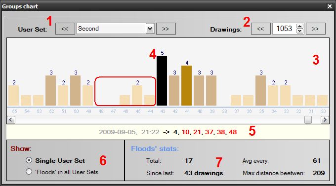
1 - Select the User Set from the list.
2 - .. and the number of draws.
3 - The vertical bars represent draws. Each bar's height depends on the number of winning numbers
that match these from selected user set (the 'Second' in the above case) - it's displayed at the top of
the bar. At the bottom of each bar there is a number indicating which draw (1st draw is the latest)
we’re looking at.
4 - In the case above, we have a chart of the 'Second' group. Within the red rectangle we see stagnation
2 days without even a single number; then 1 number, 2 and 1 again), after which a 'flood' appeared
(defined as 5 numbers – in black). You can define your own number-colors palette in Keniox's preferences.
5 - Click on the bar to see which of the winning numbers matched those from the user group.
6 - This chart can work in two ways: it can display the position/situation of a single selected group or all
groups in total (see below).
7 - Here you can see all useful statistics: total number of 'floods', number of draws since last one,
average and maximum distance beetwen floods.
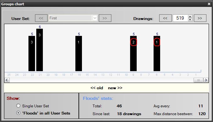
'Floods' in all User Sets

This chart shows all groups together and only 'floods' are visible.
Single bar can represent more than one 'flooded' - group. In order to be able to identify which group stays
behind, you can, in My Numbers function, give each group an abbreviated name.
In the example above (red circles), groups 'First' and 'Second' are visible as '1' and '2'.
You can change their names at any time.
Another 'wave' example

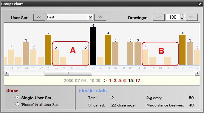
The chart above shows similar situation as the first one. In the red rectangle
'A' there are 5 draws with very small number of drawn numbers. After that downtime, that group became
really strong - a 'flood' showed up. The same 'wavelike” behavior occurs in 'B'.